


The Volunteer Connection App
Project Type: MICA | MUXD 5103 | PROTOTYPING
Role/Contribution: Project Management, Research, UX Design, UI Design
Timeline: 8 weeks
Faculty Advisor: Kieran Harrichand
Team: Sophia Ramsey, Elsa Bengu, Janet Walker
High-Level Objectives:
Create an all-inclusive app that would allow individuals to find volunteering opportunities, complete the volunteer application, sign up for events as well as give direct feedback to their local organizations while also connecting with other users.
Problem Statement
Helping foster a stronger community by connecting individuals with similar passions to volunteer opportunities.
Research & Analysis
Through the desk research that the design team conducted, we realized there was a need to streamline the application process for volunteers and organizations as it is generally determined by the organization and varies greatly between site or non-profit. There has been a growing desire for young people in particular to invest their time in their communities, but no platforms are specifically designed for the volunteer/volunteer organization communication and application process. This leaves a gap in the market as there is no website or app that will allow individuals to not only find volunteer opportunities and organizations, but to also help them apply for those organizations within the website or application. Users found the process of trying to get involved with their communities frustrating, and many would give up half way through. In addition to desk research we also employed a variety of methodologies to further our research and north star vision, including writing a creative brief, conducting a “How Might We” challenge map activity, building a proto-persona, and experimenting with storyboarding for use case scenario.
Research Findings & Take-Aways
Ease of Use + Familiarity: Eventually lead to designing the matching structure between volunteers and volunteer organizations to function like traditional dating apps such as Tinder & Bumble, as our research showed this process was generally understood and accepted by age rages 18-40+
Streamlined Application Process: There is a need to organize the sign up structure to be filled out early on to prevent “application fatigue”.
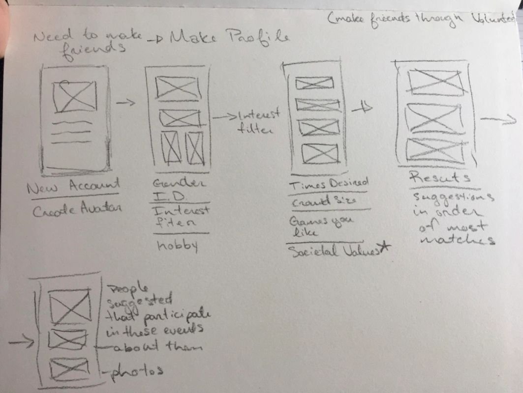
Socializing + Networking: The ability to connect with locals who are interested in similar volunteer organizations, whether for professional or personal networking, was a crucial driving factor for individuals who wanted to invest their time in their community.
Social UX: Including a “review” option after scheduled events to was a desired feature:
This would inform the volunteers “discover page” to show similar organizations to explore
This would inform the organizations of areas on which they can improve and feedback on events that were successful.
Ideation
Challenge Map

Proto-Persona

Storyboarding Exercise
Sketching
During the sketch phase we conducted a sprint sketch exercise. We completed three rapid fire rounds of sketches, lasting two minutes per round. After each round the team would discuss the features and layouts we liked in each of the sketches before continuing to the next round.
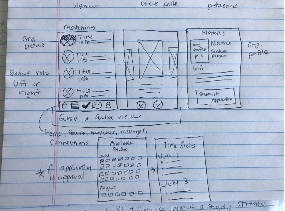
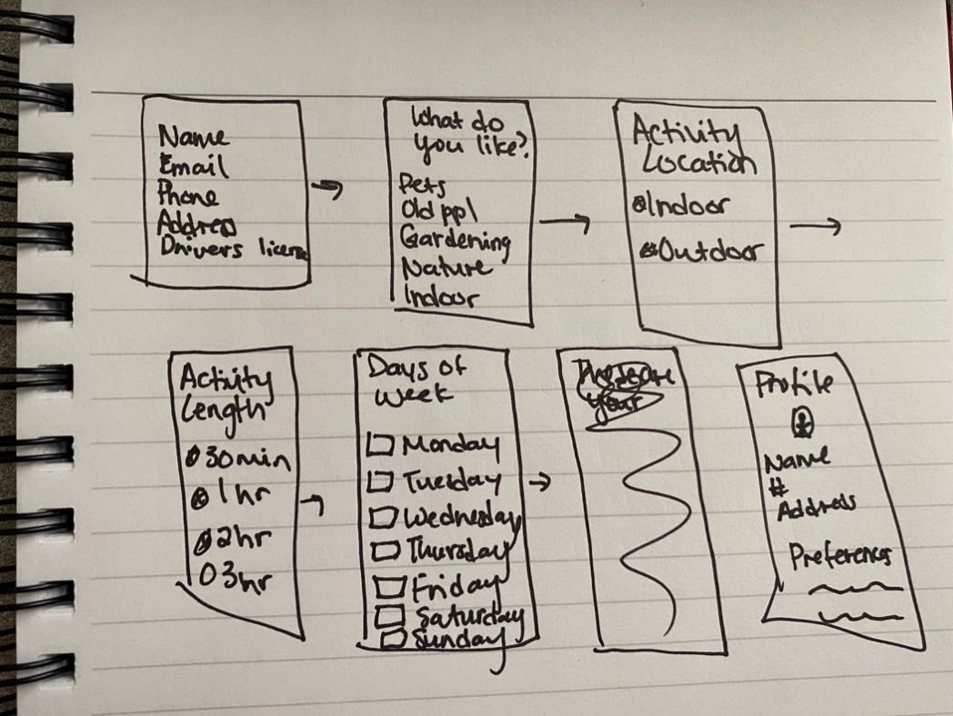
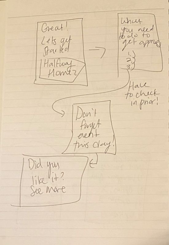
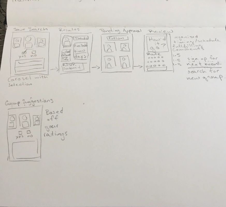
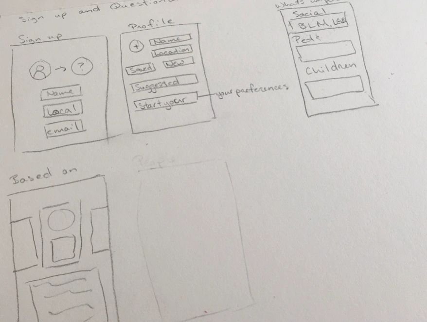
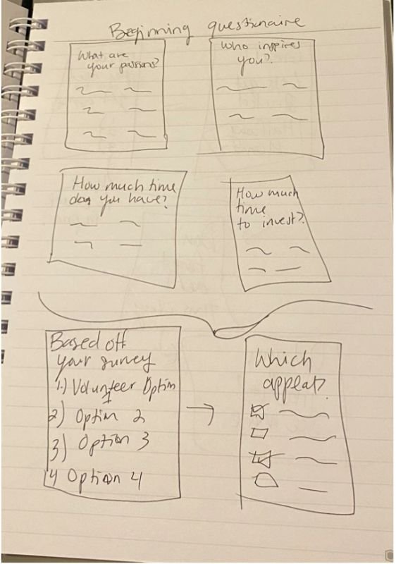
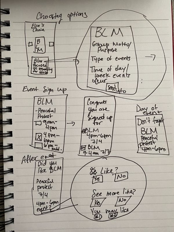
Feature List
During our rapid fire sketching session we noted the following “must have” features, and used these to jump start our encompassing feature list for the north star version of the app.

Sign In / Sign Up
Creating Profile/Background
Experience/Resume
Volunteer preferences
Availability
Organization Matching/Results
Browsing Matches
Additional Matches (Could be potentially Ads)
Organization Application Page
Pending Application Page(More Recommendations)
Organization Event Sign Up
Event Sign Up Review/Calendar page
Reminder Page (Day of reminders)
Organization/Event Review or Survey
Connections/For You/Discovery Page
Branding
The tone of the brand and logo is intended to be casual and friendly, as we are trying to help people get involved and meet others but at their own pace and with their own passions.

Prototyping
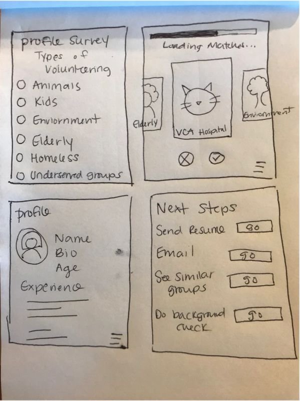
Low Fidelity Wireframes
Screen-grabs of each wire frame


Clickable Prototype with wireframes

User Testing Highlights
We conducted 5 testing activities with 5 different users.
After analyzing the results of the user testing activity, we realized that there were some common themes where improvement of flow could be made:
Under the event sign up confirmation view and the event reminder view, add in a portion as to what organization’s events the user was already signed up for.
Add the ability to pull in resume from LinkedIn since most users do not happen to have their resume saved on their phones. This would streamline application processing.
Add in icons or more text to the sign-up/account creation process to make it clearer to the user as to what information the user needs to provide.
For the experiences page, add drop downs for selected fields instead of making them all fill-ins.
Remove the “connecting with other users” feature from view until after a user has applied for groups, and build out the interaction between users.
Build out the views of what organizations would see during their user journey.
Revised Site Map
Once the low fidelity prototype was tested and the findings were analyzed, we determine what improvements could be made to our user flow. The user findings were then used to create the following site map.

Final Prototype
Screen-grabs of high-fidelity screens


Clickable high-fidelity prototype
Next Steps
Continue High Fidelity Prototype Development
High Fidelity Prototype User Testing
Explore Ideas for the Organization Side (most likely a website):
Org. Desk Research, User Interviews, Org. User Personas, Website IA, Sprint Sketches, Wireframing/Lo Fi Prototype, User Testing, High Fidelity Prototype
Add Additional Features from Ideal Features List